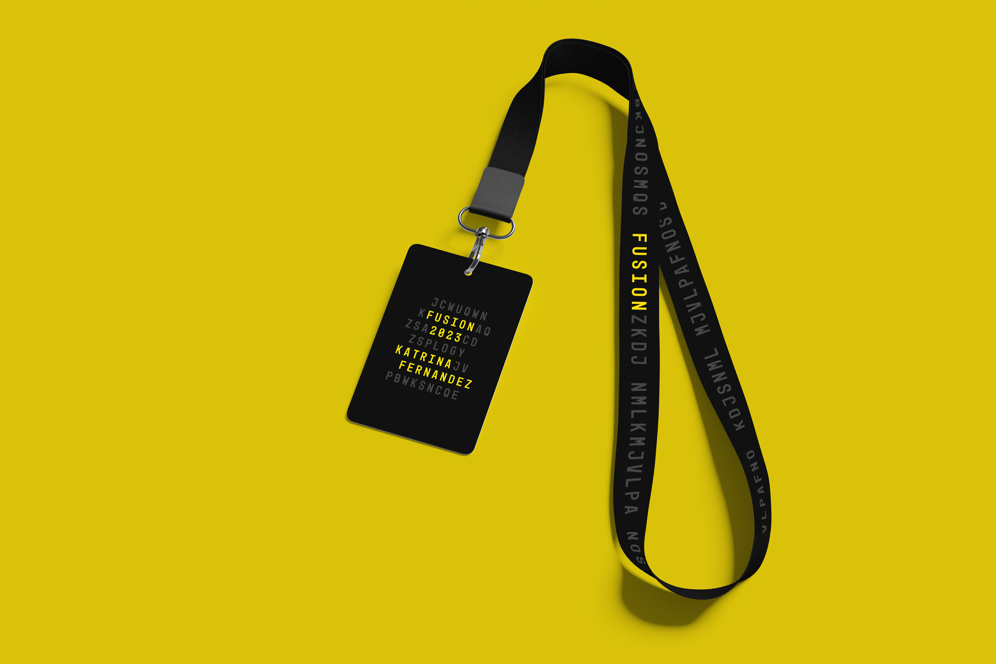
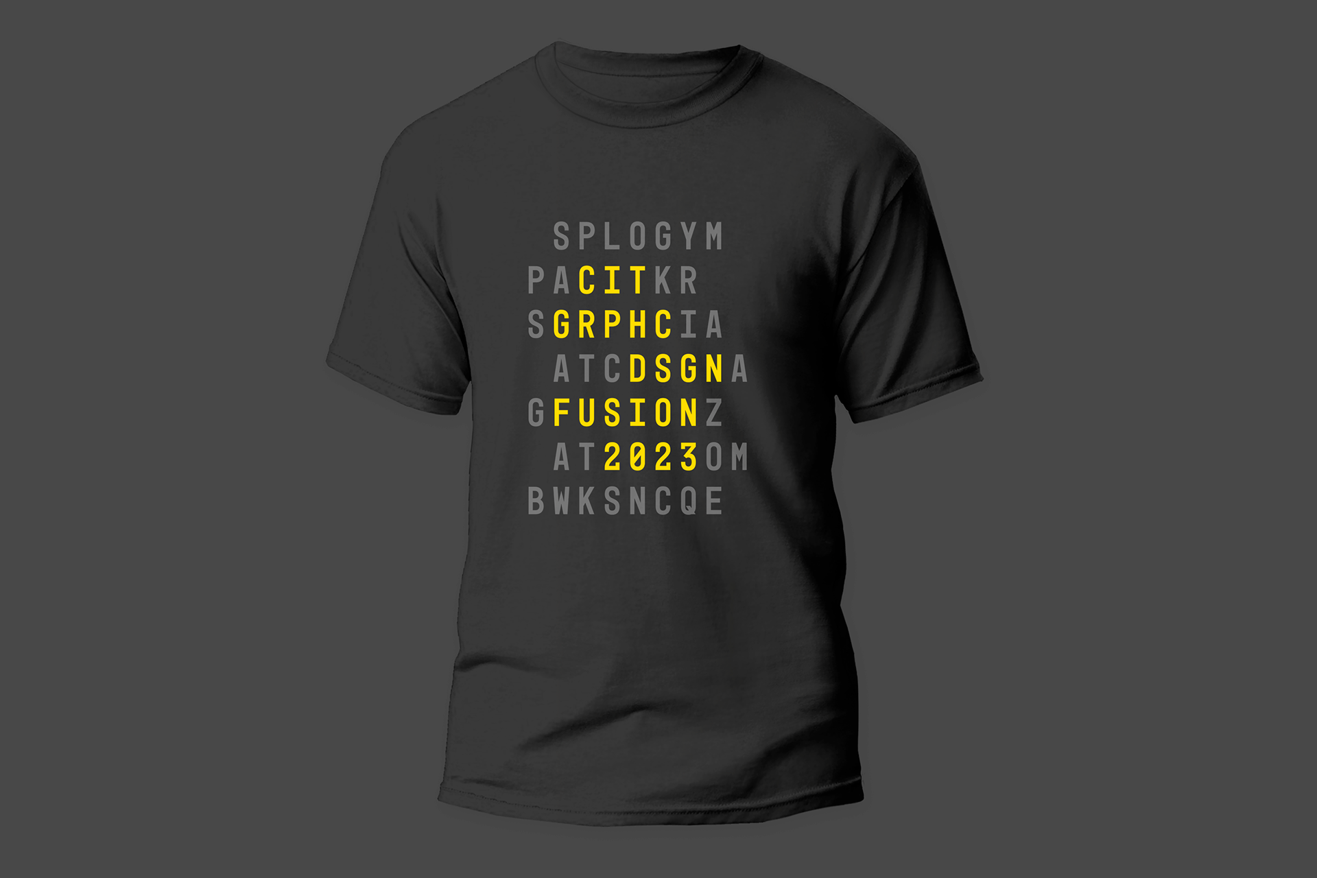
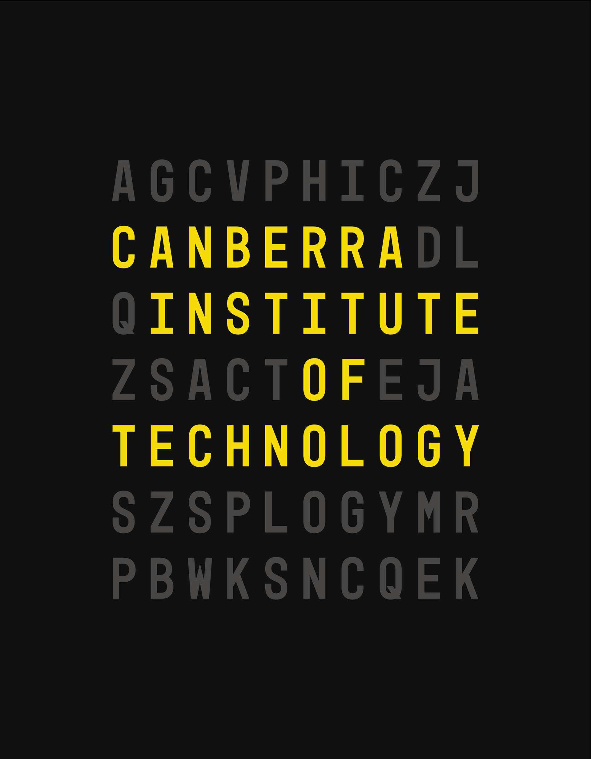
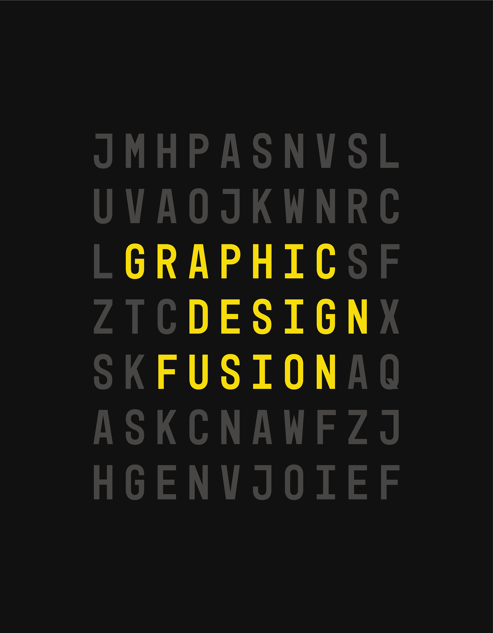
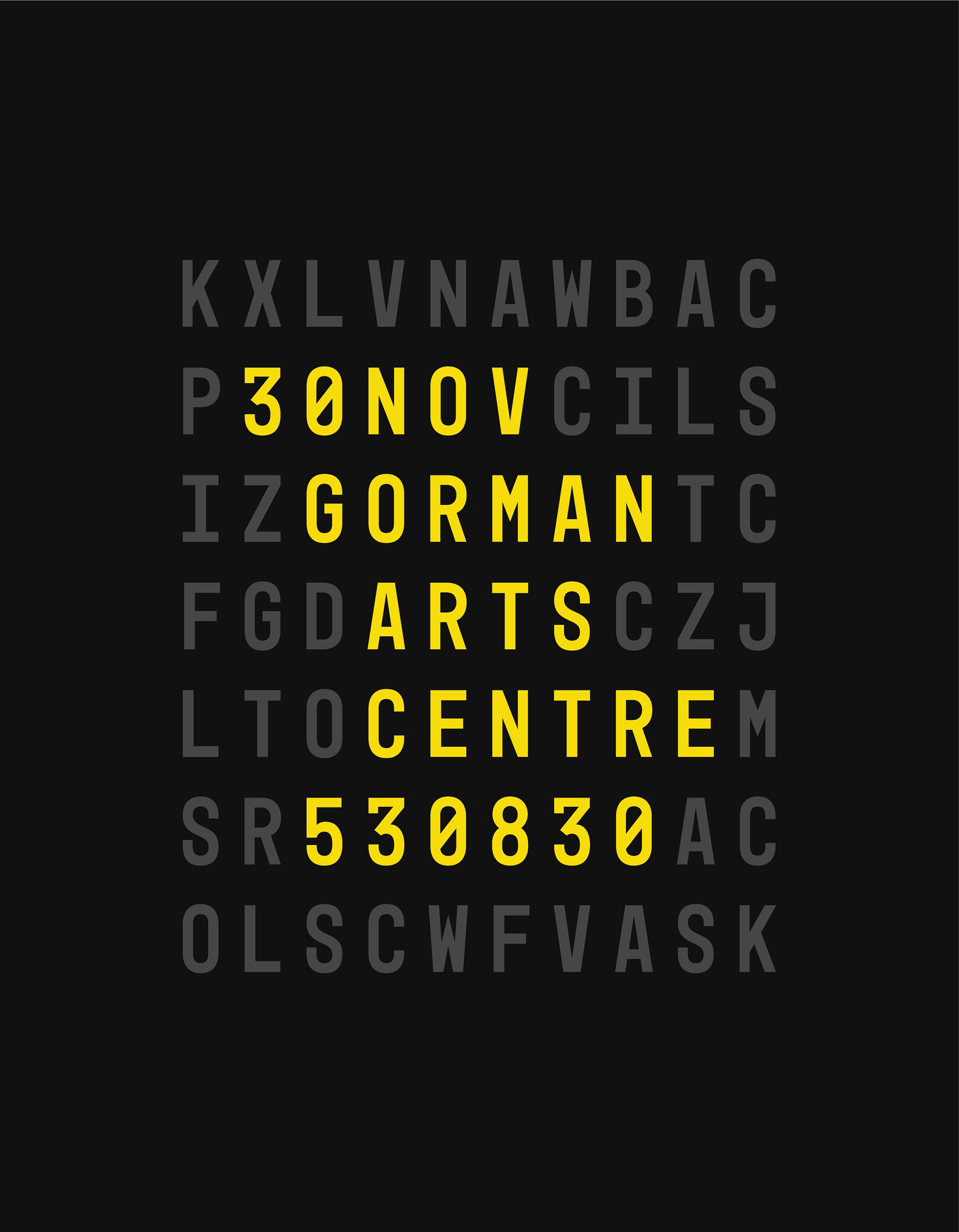
For my FUSION branding concept, I initially had a crossword puzzle in mind. A crossword puzzle symbolises connectivity, completeness, and coherence – values that resonate the meaning behind the chosen exhibition name for this year's CIT Graphic Design Diploma and Advanced Diploma exhibition.
A crossword puzzle design immediately captivates attention and engages the audience. Utilizing Monotype font within this framework adds a classic and timeless feel, enhancing the visual appeal. The distinctive characteristics of Monotype, known for its clarity and legibility, lend themselves well to the grid structure of a crossword, ensuring readability and a cohesive aesthetic.
